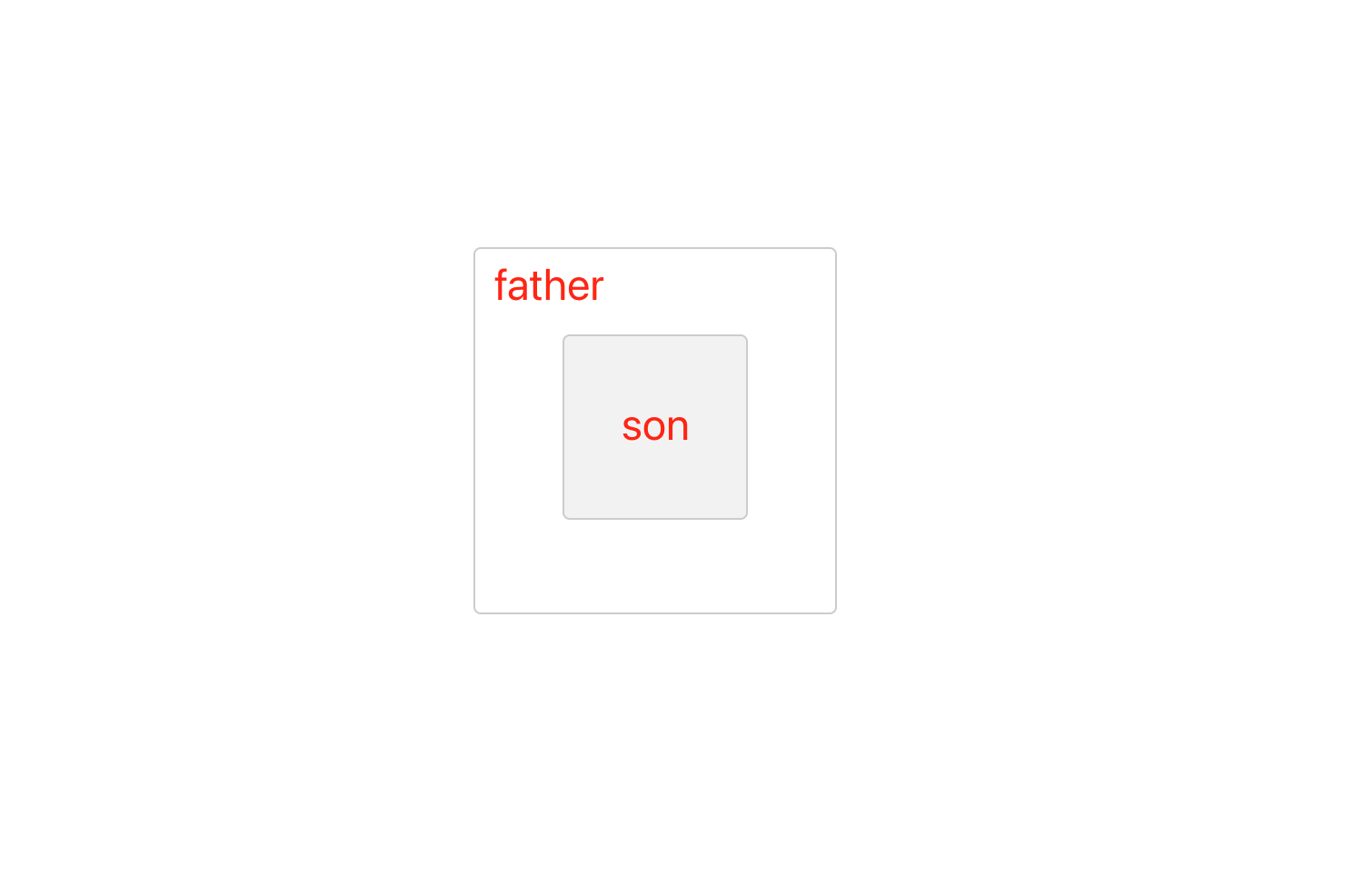
预先给边框等基础样式,方便查看位置而已
.father,.son{
  border: 1px solid #ccc;
    border-radius: 4px;
}
.father{
  width: 200px;
  height: 200px;
}
.son{
  width: 100px;
  height: 100px;
  background-color: #f2f2f2;
}
flex 弹性布局
.father {
  width: 200px;
  height: 200px;
  display: flex;
  justify-content: center;
  align-items: center;
}
.son{
  ...
}
grid 网格布局
.father {
  width: 200px;
  height: 200px;
  display: grid;
  justify-content: center;
  align-items: center;
}
.son{
  ...
}
绝对定位配合 margin:auto;
.father{
  position:relative;
}
.son{
  position: absolute;
  top: 0;
  left: 0;
  bottom: 0;
  right: 0;
  margin: auto;
}
绝对定位配合 tranform: translate(-50%,-50%)
.father{
  position: relative;
}
.son{
  position: absolute;
  left: 50%;
  top: 50%;
  transform: translate(-50%,-50%);/*修正元素本身的宽高影响居中的数据*/
}
table-cell
.father{
  display: table-cell;
  vertical-align: middle;
  text-align: center;
}
.son{
    display: inline-block;
}
以上代码效果如下